Re: [Gimp-web] Check static.gimp.org
- From: Pat David <patdavid gmail com>
- To: gimp-web-list gnome org
- Subject: Re: [Gimp-web] Check static.gimp.org
- Date: Tue, 10 Nov 2015 14:40:06 +0000
Well, poop. :)
Will you be around on Thursday at some time to meet on IRC with schumaml
and anyone else that wants to come?

By the way - anyone that would like to join us, please do on
irc.freenode.net #gimp-web

I am tentatively thinking 1900UTC to meet - does that work ok for everyone?

On Tue, Nov 10, 2015 at 4:07 AM Simon Budig <simon budig de> wrote:
Two minor issues:
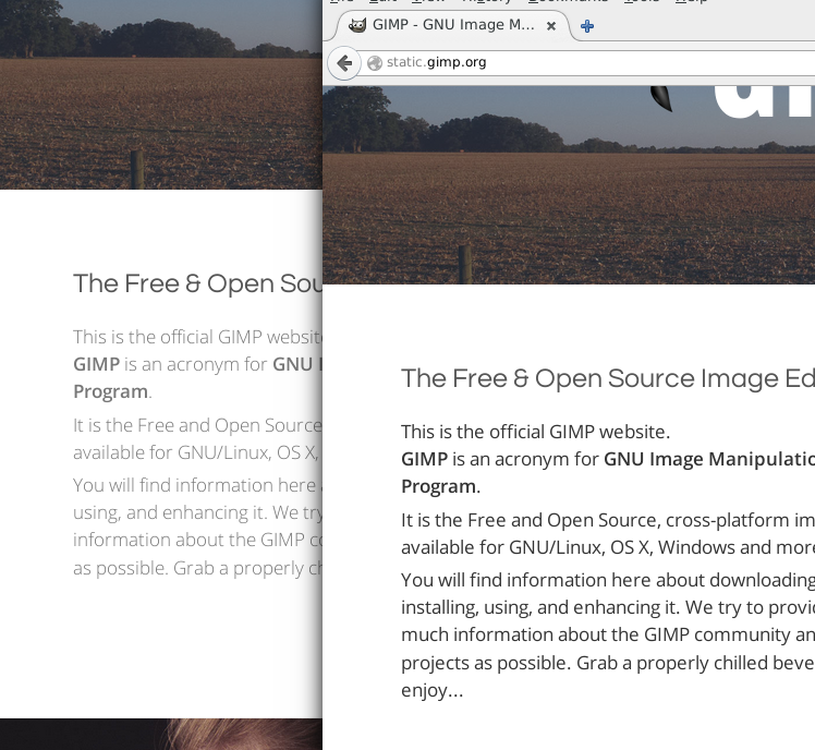
Please consider making the body text more bold and more black.
For me the text is on the brink on the unreadable due to the lack of
contrast. Given that we all age at a rate of 1s/s I'd appreciate that
:)
See http://www.home.unix-ag.org/simon/files/weight-comparison.png for a
comparison of the original and changing the weight to 400 (gimp.css:153)
and color to #333 (home.css:2).
Of course I'll have a look!  I'm hoping there might be a nice compromise.
I'm rather fond of the lighter weight, but at the same time don't want to
content to be hard to read.

I did at least try to follow the W3C web content accessibility guidelines
for contrast ratio (that light body text is actually 4.48:1 ratio, the
guidelines for text that size is actually to be at least 3!  Also - there's
a W3C accessibility guideline for contrast ratio! :) ).

http://www.w3.org/WAI/WCAG20/quickref/#qr-visual-audio-contrast-contrast

I'll render out some options later and see if we can't make it a bit more
legible.
It might be worth looking at more pages than I did. For example the news
item date is #aaa on white in a very small light font. If we don't want
our visitors to read the text it would be better to remove the text
instead  :)
Absolutely, I'll check against the entire site when we find one we like.
The news items have a (slightly) different color at the moment as well, I
believe.  I was trying to use color to differentiate secondary information
from that area, but may have gone too far. :)

pat
[
Date Prev][
Date Next] [
Thread Prev][
Thread Next]
[
Thread Index]
[
Date Index]
[
Author Index]
