
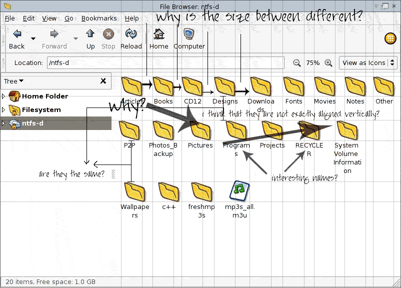
Hello all,

Because I use extensively Nautilus I've become annoyed of the awful
visual look. So, I attach 3 files illustrating this. Please, take a
look at these critics, because I'm sure they annoy many other people.
Nautilus is on of the main compents of GNOME so I think it should near
perfection. Mockup1_lin.gif illustrates my views and the things which
I want to say. Windows copes with the situatition perfectly. Konqueror
copes even better than Windows Explorer, everything aligned correctly.
I think that some fixes should be made. If I'm not right with
something I've said, please let me know.

Cheers,
gamehack
Attachment:
mockup1_lin.gif
Description: GIF image