
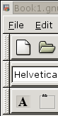
Hello,

As some of you recall I made an UI review some months ago
http://www.gnome.org/~chrisime/random/ui/ where I reviewed the esthetical
Toolbar issue related to GTK+, libgnomeui and libbonoboui. I saw that Rodney
Dawes made some patches that claim to solve these issues which can be found
here http://mail.gnome.org/archives/usability/2003-March/msg00007.html. I
have played with these patches some hours ago, patched the necessary modules
from CVS head and re-compiled the libs.

The result was pretty much 'unesthetical' and imo more wrong (from look and
feel) than it is now. It may have changed the issues of the broken look of
the Toolbars but now added another bevel around that Toolbar which looks
pretty much like the picture on the attachment (Gnumeric Toolbar). If we deal
with 2-3 Toolbars and the default GTK+ Theme then this looks quite stupid.
Later on in one of the bugreport comments it was also suggested to revisit
the Menu too and this probably means paint a bevel around it as well.

Wouldn't it make more sense changing the Toolbars to the default look of the
ones from libbonoboui which gives a FLAT feeling of the Toolbar. This is far
more esthetical. Not to mention that the patches from dobey cause entry
widgets to paint over the inner bevel as you can se ein the picture too.

Feedback welcome.
Attachment:
toolbar.png
Description: PNG image