Re: [Usability] An idea (menus and launchers)
- From: "Raphael Bosshard" <raphael bosshard gmail com>
- To: usability gnome org
- Subject: Re: [Usability] An idea (menus and launchers)
- Date: Tue, 18 Dec 2007 14:34:17 +0100
Hello there,
now that is an interesting proposition. Because it touches one of the
main issues (in my opinion) of the Gnome desktop: Multiple/duplicated
representation of objects.
Why not take it one step further?
Right now, an application may represent itself in five (!) different ways:
1) launcher in main menu
2) launcher in panel
3) entry in window list
4) entry in window selector
5) icon in notification area
Each of these object/application representations serves a specific
need, although these needs overlap or duplicate functionality.
1) launching available application
2) launching available application
3) window management
4) window management
5) status information
Why not unify all those operations in one single representation? Why
have representations of an application scattered all over the desktop?
So long,
Raphael
On Nov 16, 2007 7:44 PM, Carlos Moreno <moreno_pg mochima com> wrote:
>
> I recently came up with an idea of what could be a nice/useful detail
> for a desktop, so I thought I'd throw the idea here (not sure if the
> idea is original/unexplored, or even if it has been already done).
>
> Anyway, it's related to the Recent Documents, or rather, the Recently
> Used Files in the applications. The idea is quite simple; instead of (or
> in addition to) having just one Recent Documents in the "Places" menu,
> each particular menu item for an application could/should have a sub-
> menu with the recent documents. Also, and I think this is the nicer
> part of my idea, *the launchers* should have a sub-menu as soon as
> there are documents recently used for the corresponding application.
>
> If the user clicks on the launcher itself, then the application opens as
> usual (e.g., with a blank document); if the user clicks on the little
> arrow next to the launcher (the "drop-down" arrow), then the Recent
> Documents list opens underneath the icon.
>
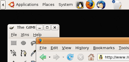
> I put two silly images to illustrate the idea. This is what the Panel,
> with an OpenOffice Writer launcher, would look like when I have
> not opened any Writer documents:
>
> http://www.mochima.com/tmp/gnome-launcher_no_recent_docs.png
>
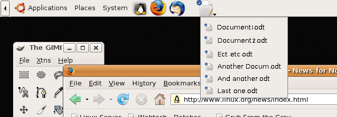
> Then, as the user opens/saves Writer documents, the launcher would
> now look like this:
>
> http://www.mochima.com/tmp/gnome-launcher_with_recent_docs.png
>
> (notice that this one is what it looks like *when the user clicks on the
> little arrow* at the right bottom corner of the launcher icon).
>
> The launcher could have an effect like the toolbar buttons (what I'm
> describing here is typically done with toolbar icons --- for instance,
> the "New Document" icon in OpenOffice has a drop-down selection
> of Writer / Calc / Presentation / etc.), where the button gets a "double
> outline" to make it obvious that we want the drop-down list.
>
> Of course, for the menus I didn't create an image --- it is quite obvious
> for the menus --- the menu item corresponding to the application gets
> a sub-menu with its related recent documents; and it is obvious for
> the user what it means and what to do about it.
>
> Does it sound like an interesting and implementable idea?
>
> Carlos
> --
>
> _______________________________________________
> Usability mailing list
> Usability gnome org
> http://mail.gnome.org/mailman/listinfo/usability
>
[
Date Prev][
Date Next] [
Thread Prev][
Thread Next]
[
Thread Index]
[
Date Index]
[
Author Index]
