Am 09.12.2010 17:20, schrieb zekopeko:
> On Thu, Dec 9, 2010 at 8:22 AM, Matt Sturgeon <mttza1 gmail com
> <mailto:mttza1 gmail com>> wrote:
>
>     Hi,
>
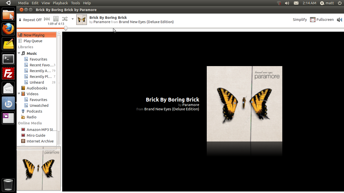
>     I today spent a considerable part of the night creating this mockup
>     of how i think the banshee toolbar should look. You should find it
>     both attached and embedded as html.
>
>     I also included my GIMP xcf file (fully layered, with intuitive
>     layer-names) if anyone wants to have a play around.
>
>     MOST of the fundamental changes should be simple and at
>     widget-toolkit level, however the overlapping
>     progress-slider-drag-button (which id like to only be shown when the
>     progress-bar is hovered over) may be more difficult to implement. If
>     anything is too difficult to implement by 2.0, or goes against the
>     vision of banshee's future, please email me and well discuss it :)
>
>     Changes:
>     * Moved the Repeat mode chooser to the main toolbar, thus removing
>     the need for a status bar, and saving space.
>     * Moved the progress tool to the bottom-edge of the toolbar, the
>     drag-button should be a kinda 'autohide', only appearing when the
>     mouse hovers over the progress-bar.
>     * the timestamp/progress-clock is moved to a position under the
>     playback controls, since the progress-bar is no longer in the main
>     section of the toolbar, this is more intuitive, and a better option
>     than placing it inline, or deprecating it.
>     * Since the statusbar is removed, the main section of the window has
>     around 30/40 pixals more space, for the sake of moving one button
>     (plus any extention buttons) to the toolbar.
>     * To prevent bugs caused by the missing statusbar, items that would
>     otherwize be drawn there should be drawn on the right of the
>     toolbar. (the same place the Simplify, or Visualizations buttons
>     appear).
>
>     Original screenshot taken on Ubuntu Desktop 11.04 Alpha 1, with
>     banshee 1.9.0.
>
>
>
>     _______________________________________________
>     banshee-list mailing list
>     banshee-list gnome org <mailto:banshee-list gnome org>
>     http://mail.gnome.org/mailman/listinfo/banshee-list  (unsubscribe here)
>
>
> I don't like it. The toolbar feels cramped and the position of the
> progress bar is completely wrong IMO.

Same here - the progress bar directly at the bottom of the toolbar is
too low and compressed with the text. Getting the slider to appear might
be quite difficult. Additionally, it would appear everytime the cursor
slides over the progress bar which seems annoying to me.

One idea struck me thinking about the low progress bar though: What
about having the progress bar cover the whole top bar in some
transparent way? Having it behind all the buttons would look nice, but
also make seeking hard since some areas are covered by buttons. Maybe
something similar?

Marcel
_______________________________________________
banshee-list mailing list
banshee-list gnome org
http://mail.gnome.org/mailman/listinfo/banshee-list  (unsubscribe here)

Attachment:
BansheeMockup2.png
Description: PNG image
Attachment:
BansheeMockup2.xcf
Description: image/xcf