
On Thu, 2003-06-26 at 12:13, Jakub Steiner wrote:
> On Thu, 2003-06-26 at 11:01, Luca Ferretti wrote:
> > What about shadow?
>
> Similar to my comments to the paper sheet, the shadow looks quite odd.
Yes, you can't vertically place a CD in the real world, but:
* a Desktop environment is not the real world: just mimes it, but
it's not forced to follow all rules.
* hey, it's GNOME: it must have a little kind of magic :-)
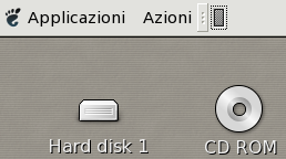
* imagine the cd icon nead the... mmhh.. boxed hard disk on your
website (see attach) or current default trash: both are objects
placed on desktop, but shadows suggest a 'space's deformation',
as well as you are near a black hole... this is odd to IMHO
Personally I like it: it's witty, it's fresh, it suggests you are
clicking on an object.
> The stroke is way to thick and blurry too. I know it's tough to do in
> GIMP, but try this:
>
> Create a circular selection of the outer border. Fill with black. Create
> a new selection, 1px smaller in diameter. Now cut _twice_.
>
hemmm... 2px in diameter, or 1px in ray, I hope...
> It's necersary to create a new selection and not shrink it. Cutting it
> twice will make the border more crisp.
Yeah, better. Many thanks. I'll apply to button emblems too: actually
I'm using a simple filled black circle in bottom level and a colored
filled smaller circle in top level.
> Similar effect can be created
> using the levels tool on the quickmask.
>
> 1. create circular selection
> 2. subtract the inner circle from the selection (the alt-reposition
> in gimp-1.3 is essential for perfect positioning)
> 3. change to quickmask
> 4. use the levels tool to 'crop' the highlights of the tonal range.
> this will make the blurry borders more crisp
> [http://jimmac.musichall.cz/screenshots/stroking.jpeg]
> 5. change back to selection. fill with black
>
> Attached is three sample images:
> 1. simple cut of the inner circle
> 2. double cut
> 3. using levels tool on the mask
>
> Hope this was helpful ;)
--
Think bigger
My uncle
Attachment:
Schermata.png
Description: PNG image