Re: developer website tabs mock-up
- From: Ryan Pavlik <abiryan ryand net>
- To: GNOME web list <gnome-web-list gnome org>
- Subject: Re: developer website tabs mock-up
- Date: Mon, 21 Mar 2005 23:31:02 -0600
James Henstridge wrote:
Ryan Pavlik wrote:
James Henstridge wrote:
Here's something I put together over the weekend:
 http://www.gnome.org/~jamesh/web-test/developer.html
I've taken some real content from the various developer websites to
give a better impression of how the "developer website tabs" would
work.
I've also lifted the updated Gnome logo off of Sebastien's masthead
mock-ups to see how they fit in (this was done fairly quickly in the
gimp using the colour -> alpha tool, so we shouldn't use this
particular image on the main website).
I mentioned this on IRC, where I got some positive and some negative
responses. Some of the problems people mentioned include:
   * Confusion over the row of links above the row of tabs
   * Looks too busy/confusing (possibly due to different alignment of
     the two rows of links)
   * Not clear how the first row of links relates to the second row

Does anyone else have anything to add?

James.
I would be inclined to suggest the tabs, if used, should be the top
level navigation, therefore revealing "sub-links" that are different
on each tab, and therefore are a little less confusing. I suspect
this might be a bit much, however, since that's a cross-site thing.
If there's any way the line under the active tab could be removed,
and the non-active ones could be made to look like the active one
does now, it would futher the "tab" metaphor a bit more naturally:
otherwise the other tabs sort-of just float.
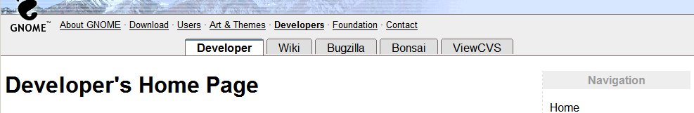
I'm not sure what you mean about the line under the active tab. There
is no bottom border under the active tab on the systems I've tested with:
http://www.gnome.org/~jamesh/images/devel-tabs-v3.png
As for the tab colouring, the idea is that the active tab and the
content below it are joined (as they would be with physical notebook
tabs, which the UI is modelled after). So it makes sense for the
active tab colour to match the page background colour.
The other tabs were darkened, and have the bottom border visible to
separate them from the main page content.
James.
Ahh. Therein lies the problem. Firefox 1.0.1 is rendering it different
for me. See attached PNG for what I see. What you see is what I was
suggesting :D
--
Ryan Pavlik
--
"Forget injuries, never forget kindnesses."  --Confucius
[
Date Prev][
Date Next] [
Thread Prev][
Thread Next]
[
Thread Index]
[
Date Index]
[
Author Index]
