Proposal for insensitive buttons
- From: David Santiago <mrcooger cyberverse com>
- To: gtk-devel-list redhat com
- Subject: Proposal for insensitive buttons
- Date: Fri, 7 Apr 2000 14:29:20 -0700 (PDT)
Hey guys, me again. Jim Cape and I were talking last night about
insensitive buttons, and how they don't really give you any sign that they
are insensitive other than their label colors. MacOS will draw buttons
that can't be pushed as flat 2D, without their 3D look. Personally, Jim
and I agree that when you're looking at a screen with lots of buttons,
having the insensitive buttons look significantly different from the ones
you can push would be a big help. So we've proposed that insensitive
buttons be drawn with the GTK_SHADOW_ETCHED_IN style to differentiate them
better visually.
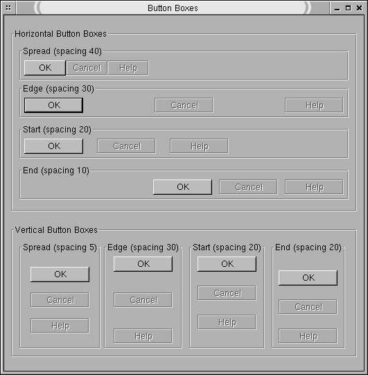
I've included three items here. The first is Jim Cape's artist's rendition
of what this should look like. The second is a patch for gtkbutton.c which
implements this fairly trivially (haven't found any problems with it), and
the third is a screenshot of this in action (using a badly hacked up
version of the buttonbox example program. We're talking 45 seconds of
hacking on buttonbox.c, folks).
What do you guys think?
David :)
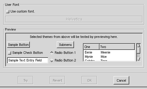
insensitive.png
Index: gtkbutton.c
===================================================================
RCS file: /cvs/gnome/gtk+/gtk/gtkbutton.c,v
retrieving revision 1.42
diff -u -r1.42 gtkbutton.c
--- gtkbutton.c	1999/11/22 21:52:45	1.42
+++ gtkbutton.c	2000/04/07 21:09:58
@@ -578,6 +578,8 @@

       if (GTK_WIDGET_STATE (widget) == GTK_STATE_ACTIVE)
 	shadow_type = GTK_SHADOW_IN;
+      else if (GTK_WIDGET_STATE(widget) == GTK_STATE_INSENSITIVE)
+	shadow_type = GTK_SHADOW_ETCHED_IN;
       else
 	shadow_type = GTK_SHADOW_OUT;
2000_04_07_142401_shot.png
[
Date Prev][
Date Next] [
Thread Prev][
Thread Next]
[
Thread Index]
[
Date Index]
[
Author Index]
