
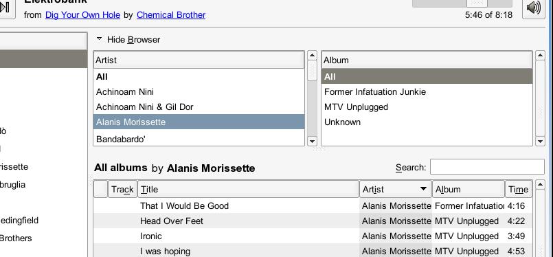
First of all, thanks to all the developers and contributors for a great
piece of software.
I use RB as my only music player, and I like it alot. I have some pet
peeves about the track browser GUI, though.

1) The browser works hierarchically (Artist->Album->Search) but this is
not evident in the GUI. The Artist/Album lists are both flat lists, with
similar sizes and everything. The search bar filters what is selected in
them, but is placed higher, which might suggest to a new user that it
filters the whole library upfront.

2) When the browser is closed there's no clue anywhere of the currently
selected Artist/album, unless you look at the tracks. Even worse, the
search bar is still visible and keeps filtering on the _hidden
selection_. It's the dreaded "some invisible controls are silently
affecting the behaviour of the visible ones" thingie that is just plain
wrong (tm) usability-wise IMO.

Simple suggestion: add a label status line over the tracks list to show
the currently browsed album/artist. Move there the search bar to make it
clear that it comes last and affects _that_ previous album/artist
selection (see the attached mockups, not pixel-perfect but hey :) )

I think it makes the UI much clearer, the con is that we obviously lose
one or two rows of vertical space.

--
Elia Cogodi <eliacogodi tin it>
Attachment:
RBBrowse_mockup_open.jpg
Description: JPEG image
Attachment:
RBBrowse_mockup_close.png
Description: PNG image