
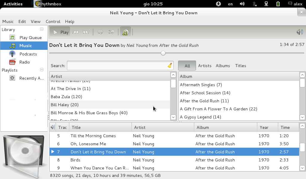
I knew it wasn't what you meant, but it was a way to show of how much
vertical space we can reappropriate.
Your reqested mockup is here, and it's pretty nice too.
a.

On gio, 2011-10-06 at 17:44 +0100, Peter wrote:
> On Thu, Oct 6, 2011 at 4:51 PM, alex <josephk email it> wrote:
> > hi Peter,
> > just one thing: my primary pc in the last 2 years and half is a 10"
> > netbook; rhythmbox on netbooks it's unusable.
> > if we want to seriously do something for its interface, that is to say,
> > for users, well, there's a lot of vertical space to save if we want to..
> > lots of immature new media players showed how it is possible.
> > this mockup push even further this discourse
> > cheers
> > alex
>
> That isn't quite what I meant. I find the side pane isn't tall
> enough when cover art is shown - so I want the side pane
> to go down (where the status bar was, which you did),
> but also up (where the current song name can be, and
> where the tool bar is).
>
> i.e. Try and give the side pane almost a full column.
>
> Peter


 --
 Caselle da 1GB, trasmetti allegati fino a 3GB e in piu' IMAP, POP3 e SMTP autenticato? GRATIS solo con Email.it http://www.email.it/f

 Sponsor:
 Centinaia di Idee Regalo a partire da 1 euro! Su MisterCupido.com alta qualita' a prezzi imbattibili... e spedizioni in 2/3 giorni!
 Clicca qui: http://adv.email.it/cgi-bin/foclick.cgi?mid=11452&d=6-10
Attachment:
oversided.jpg
Description: JPEG image