Re: [Rhythmbox-devel] New mockup, new thread
- From: Kristian Harms <kr-harms online no>
- To: rhythmbox-devel gnome org
- Subject: Re: [Rhythmbox-devel] New mockup, new thread
- Date: Sun, 11 May 2003 04:00:32 +0200
Kristian Harms wrote:
>
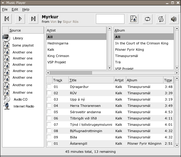
> The box/border around the middle "area" in the toolbar area seems
> awkward and not very gnomish, as others have said, but removing it leads
> to other problems. So what to do? In iTunes, Apple have made this area
> seemingly without using the native widgets, opting instead for a kind of
> ad hoc solution resembling the display of a physical music device, with
> a greyish background. This way, they avoid the awkward border in the
> screenshot above, and they also avoid the "visual need" to have the
> volume slider and the position-in-track thingy be vertically aligned to
> each other, and they avoid confusing users as to the differences between
> the two sliders. Rhythmbox could be similar, using a white rectangle
> instead of a rounded grey area as in iTunes. The "position in track"
> widget would need to look entirely different from the volume slider,
> though that might be difficult to code since it would be an ad hoc
> widget and not something from GTK (i might be wrong).
>
> The white rectangle would be like the one in the following screenshot,
> but centred, larger and containing the "$Trackname from $Album by
> $Artist" text together with the "position in track" widget and some
> numbers giving elapsed time of the playing track. The screenshot:
> http://xsu.sourceforge.net/search4.png
>
I'm replying to myself to say that I've gimped Daniel Borgmann's
screenshot to be like what I described. Although not a perfect mock-up,
I think it looks good and gnomeish all at the same time.
http://www.student.uib.no/~st01806/rhythmbox-white-area.png
The progress indicator can be thick, allowing it to contain some text or
numbers, or thin like in iTunes, with the text and numbers some other
place in the white "display" area.
As the mock-up indicates, the progress indicator can have some sort of
indicator showing how much has been buffered in those cases where that
is relevant information.
I should say that I also somewhat like the c.png mockup that Mark Finley
attached in the newest thread, but it does have a few problems:
(a) The progress indicator seems very short, and it's position seems a
bit arbitrary and untidy -- I think it's important that it use as much
width as one can get away with, because using the mouse to track down a
particular point in a song can be difficult if the "resolution" of the
slider is too low (and also, the difference in length helps distinguish
it from the volume slider).
(b) It obviously lacks the special button and the volume slider.
Solving (b) (putting those two things back in) will make the whole
toolbar a little thicker/higher, and with that extra height why not move
the progress indicator below the track/album/artist text? Then you've
solved (a) as well. And then you're pretty much back to Daniel
Borgmann's mockup or my gimped version.
--
Kristian Harms
[
Date Prev][
Date Next] [
Thread Prev][
Thread Next]
[
Thread Index]
[
Date Index]
[
Author Index]
