Re: gnome-utils branched for GNOME 2.16
- From: Bryan Clark <bclark redhat com>
- To: Emmanuele Bassi <ebassi gmail com>
- Cc: desktop-devel-list gnome org
- Subject: Re: gnome-utils branched for GNOME 2.16
- Date: Wed, 06 Sep 2006 15:59:43 -0400
Emmanuele Bassi wrote:
Hi Bryan;

On Wed, 2006-09-06 at 11:49 -0400, Bryan Clark wrote:
Wow, it's gnome-utils branch deja vu all over again! [1] :)
Indeed. :-)
Last time the thread died out pretty quickly, and since I had to push
back the UI work on the screenshot app, I'd like to nail it down for
real this time.
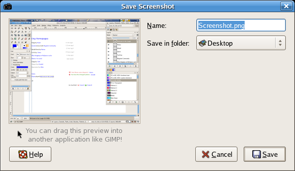
The first, obvious transition is to a save dialog window with the same
behaviour of the GtkFileChooserDialog, to use the tab completion + full
path editing of the destination file; the currently used layout (preview
+ save stuff + (save, cancel, help) buttons can be bolted without much
effort on a GtkDialog with an embedded GtkFileChooserWidget in save
mode. This is the structural change that I have in mind at the moment.
Using a vertical layout might be the next move - I think there's too
much wasted screen real estate in the current dialog.
I think the tab completion is probably a good idea. I'm wary of going
more towards a unified and consistent system vs. doing hacks that simply
make the screenshot dialog better. For instance I believe someone
mentioned in a previous mail that the fact that the file extension is
included in this entry is a bit cumbersome. You can't save as a jpg or
gif here so it's no use to require me to type in 'png', I hope that
doesn't get inherited from using the filechooser widget.
And as for screen real estate I think I have an unfinished blog post
around somewhere describing the dangers of working towards optimum use
of "screen real estate". The summary of the post is that real estate is
mostly about "location, location, location" and nothing to do with
efficient use of size or space. Things like this [1] are how people
take something designed for human use and rearrange for improved
consistency over clarity. Conveying the proper message or meaning is
the goal of the application over filling in the blocks of empty space.
Not to say that there couldn't be cleaning up of the dialog. But one of
the elements I'd like see kept in the design is the left to right flow
of the dialog; this of course isn't internationalized. We put the
screenshot preview on the left side of the dialog because when it first
opens you want to examine the screenshot preview first, then handle
changing the filename, then the lower buttons. I don't have any eye
tracking usability tests to prove this is working, but that was the
intent of the design. We had prototyped a number of mockups that I
aparently can't find now. But if the dialog gets rearranged to have the
preview on the right hand side and all the other widgets on the left it
requires a person to scan over the whole dialog to check the preview,
then scan back to where they change the filename, then scan back over to
find the save button.
I think it's time to take a couple steps back from this and talk about
the experience you're expecting to enable with the screenshot app.
We're starting to wind down the hole of adding in features and I'm not
sure where we're going with it. I'm pretty sure I designed the current
screenshot dialog last year or so with jrb and our goal was to let you
quickly see the preview of your screenshot, the file name and the
directory that file would be saved to. The use case was something like
shaunm or other people who are taking a number of screenshots of
different windows and the whole desktop and I think we nailed that
pretty well.
Yep, and it works well - also, having drag and drop support makes the
"edit in GIMP button" feature kind of a moot point: I can drag the
preview on GIMP and have it ready to be edited.  This might pose a
problem for the a11y people, though.
Wow, I actually had no idea you could do that. That tends to save a bit
of time. Perhaps it would be worthwhile to let people know that is
possible with a simple text area, see attached. As a side note I've
noticed in web programming that people are less afraid of keeping in
helpful hints for using web applications than we are with our
applications and that doesn't make sense to me. Something like what I
attached is pretty simple and useful and doesn't get in the way of the
dialog at all. *shrug*
Of course this addition is only for the the application menu launch
which I think is a nice trick to help out new people and advanced
users. However on my long drive to work this morning I was wondering if
we couldn't just take individual screenshots of the applications as well
as a whole screenshot all at once. Doesn't composite or something allow
this? I mean we don't have flying cars yet in 2006, but I was hoping we
could at least get this little improvement. And I think it would help
everyone (first time screenshotters, plus advance types) if the
screenshot dialog just gave me a screenshot of the whole desktop plus
individual screenshots of each application. Maybe it allows me to
select which one I'd like to save?
This could be a nice idea.

I'll open a bug to block on, with a dump of the UI ideas of the thread,
but I'd like more comments on it; I'll also blog about it.
Great, sounds like a good plan.
[3] I'm pretty sure there's a bug somewhere I got CC'd on about opening
screenshots directly into GIMP, I feel like this is the wrong place for
that. Instead I think we could do something like tagging a screenshot
with 'screenshot' category and GIMP should be aware of new screenshots
created when I go to use it (just an idea).
This is part of the recent files support that I'd like to add to the
screenshot app now that we have the API in GTK+; adding a custom
"Screenshot" when saving a screenshot is not a big deal.
Cool, I like that idea as well.

~ Bryan

[1] http://www.youtube.com/watch?v=0pXL5_RvGrs
[
Date Prev][
Date Next] [
Thread Prev][
Thread Next]
[
Thread Index]
[
Date Index]
[
Author Index]
