Re: New gtkpaned look.
- From: Owen Taylor <otaylor redhat com>
- To: gtk-devel-list redhat com
- Subject: Re: New gtkpaned look.
- Date: 18 Feb 2000 12:26:31 -0500
Dan Rosen <dr@cs.brown.edu> writes:
> > I find them very small and hard to see.. I took the pic and made them
> > larger and asked 2 people here which one they preferred and they agreed
> > with me that the small dots were too small..
> >
> > http://www.cs.umu.se/~stric/tmp/splitter.png
>
> I agree with you as well, that they were too hard to see. I like your
> modification very much, although I would personally prefer to see the dots
> "sunken" instead of "raised" (I'm not sure what the terminology is).
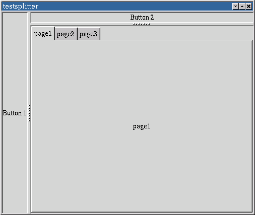
I think Tomas is right and we should go with 3x3 dots rather than 2x2 dots.
I also had the feeling that the 2x2 dots were a bit small at 100dpi.
I'm not completely how to best draw the 9 pixels.
http://people.redhat.com/otaylor/splitter.png
gives two variants on the theme (one for the vertical and one for
the horizontal) which change the light color to the light color
for bevels instead of the prelight color change a few other things.
Both of them are a little less "sharp-edged" than Tomas's original.
Jonathan started with sunken dots but I convinced him to switch to
raised dots because raised dots are what you would want in the real
world - sunken spots in a handle don't give you much of a grip.
Regards,
Owen
[
Date Prev][
Date Next] [
Thread Prev][
Thread Next]
[
Thread Index]
[
Date Index]
[
Author Index]
