Re: New gtkpaned look.
- From: Karl Nelson <kenelson ece ucdavis edu>
- To: gtk-devel-list redhat com
- cc: kenelson sequoia ece ucdavis edu
- Subject: Re: New gtkpaned look.
- Date: Fri, 18 Feb 2000 16:19:21 -0800
> I think Tomas is right and we should go with 3x3 dots rather than 2x2 dots.
> I also had the feeling that the 2x2 dots were a bit small at 100dpi.
> I'm not completely how to best draw the 9 pixels.
>
> http://people.redhat.com/otaylor/splitter.png
>
> gives two variants on the theme (one for the vertical and one for
> the horizontal) which change the light color to the light color
> for bevels instead of the prelight color change a few other things.
> Both of them are a little less "sharp-edged" than Tomas's original.
>
> Jonathan started with sunken dots but I convinced him to switch to
> raised dots because raised dots are what you would want in the real
> world - sunken spots in a handle don't give you much of a grip.
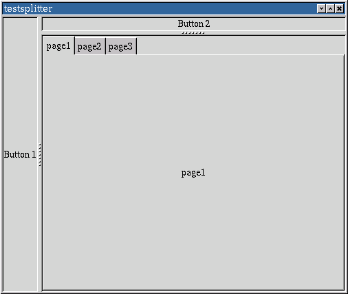
I heard something a while back about adding a separator to the style
specfications. It seems to me that after hearing this about a
grip that perhaps there should just be a draw_grip_box(x1,x2,y1,y2,orient,thick
)
used for all of the common grips like tear offs and paned.
It would be just like a box with orient specifying something about
the nature of the grip.
(HOR,1)
* * * * *
(VERT,1)
*
*
*
*
*
(VERT,3)
* *
*
* *
*
* *
Be default they would all have the raised button "grip" look.
Thus rather than ending up adding a style for every subcomponent
of widget set, we just get common ideas that can be shared.
--Karl
[
Date Prev][
Date Next] [
Thread Prev][
Thread Next]
[
Thread Index]
[
Date Index]
[
Author Index]
