Re: [Rhythmbox-devel] yet another new mockup (meta)
- From: MArk Finlay <sisob eircom net>
- To: Benjamin Otte <in7y118 public uni-hamburg de>
- Cc: Daniel Borgmann <spark-mailinglists web de>,rhythmbox-devel gnome org
- Subject: Re: [Rhythmbox-devel] yet another new mockup (meta)
- Date: 13 May 2003 16:01:49 +0100
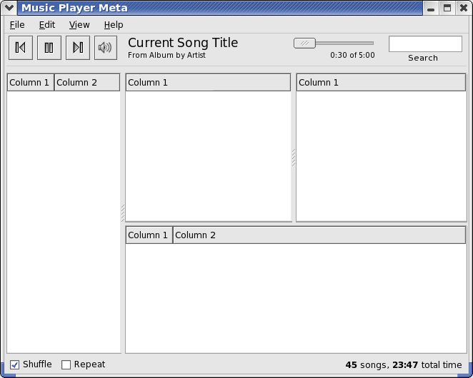
I've made up a mockup to address some of these points and other things
that bothered me. Don't forget "Less is more". Good Ui design is about
removing things not adding them ;)

> Volume has nothing to do with play/prev/next and therefore shouldn't be
> grouped with those buttons. Besides that volume is a preference.

I agree to an extent but refuse to put it on the status bar cus that's
just horrible. It may not be perfect but it's current position is the
best i think.

> Show/Hide browser is a preference too and has nothing to do in the middle
> of my window. I'm managing songs in that region of the window, not
> appearance.

Agreed - I was thinking about it and some poeple like the browser and
some don't but it's not something that the majority of people are going
to want to toggle regularily so should be left as a preference in the
view menu. And if there is some small amount of users who want to toggle
it regularly then they can use the key binding.

Removed in my mockup

> And the slider isn't long enough.

Count yourself lucky it's there at all. Also it's very easy to be
accurate with it using the keyboard.

Also I've removed the meta-button. Thinking about it:
* It's confusing without text but text is going to be extrememly
impossible when trying to translate it.
* Create Playlist and Create smart playlist should be avaliable
from all sources as it is a function related to the source browser and
that is always visable.
* Burn should work in both the library and playlist
* No reason why you should have to be looking at the audio cd source
to rip it.
All in all I think that using a meta-button is going to be problematical
and inflexible.

I've moved the search back up to the toolbar. I really don't like having
that area at the top of the library browser. I think it really takes
away from the overall symetry of the program and it confuses the
toolbar.

I really don't think that anyone is going to be confused by having the
search on the toolbar.

The only issue remaining is those checkboxes. Some poeple really don't
like them. I'm not too bothered by them but would be interested if
anyone has a better idea that doesn't clutter the toolbar. Personally I
wouldn't mind having them removed totally as i never use them - just
leave them on all the time.

--
		 .--= [ MArk Finlay - sisob ] =--.

        [ Gnome User's Board : www.gnomesupport.org/forums ]
    [ Public Key: http://evolvedoo.sf.net/sisobatericomdotnet.asc  ]
rhythmbox-meta2 (copy).png
[
Date Prev][
Date Next] [
Thread Prev][
Thread Next]
[
Thread Index]
[
Date Index]
[
Author Index]
